LOGO DO'S AND DON'TS
Listed below are the dos and don'ts of utilizing Villanova logos on accepted projects.
What to Do
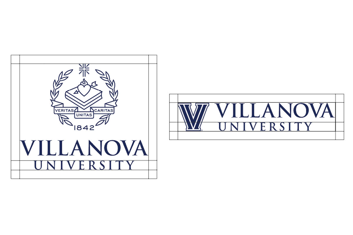
To ensure its integrity and visibility, the Villanova University logo and the Villanova “V” should be kept clear of competing text, images and graphics. The logos must be surrounded by an adequate clearspace—in any given format, a space equal in size to the height of the word “University”, as shown above.
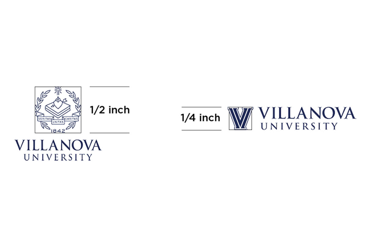
The Villanova University logos may be scaled proportionately to fit everything from directional signage to small brochures. To ensure successful reproduction, the crest should not be reproduced smaller than .5 inch high and the V should not be reproduced smaller than .25 inch high.
What to Avoid
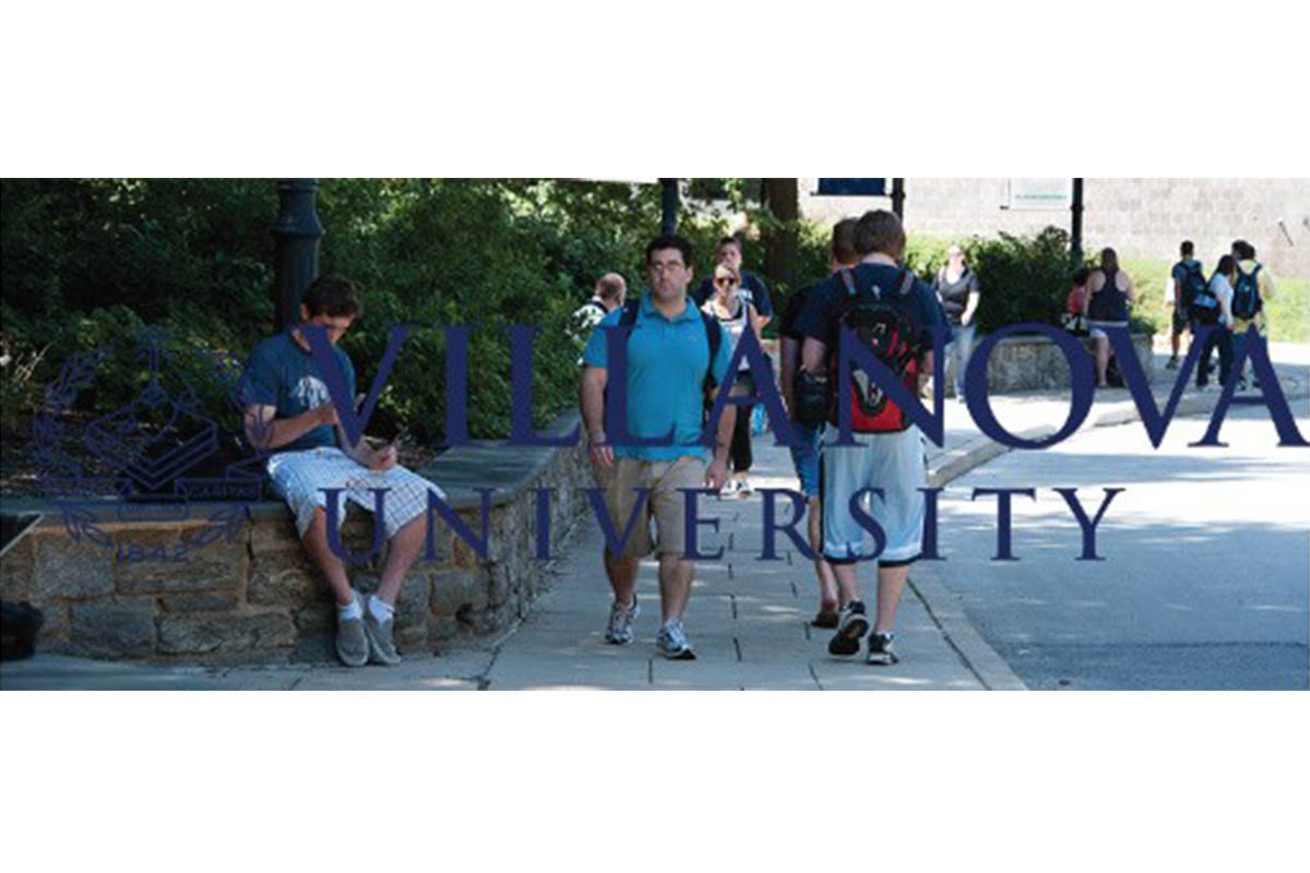
Do not place on backgrounds or images that hinder the readability of the logo.
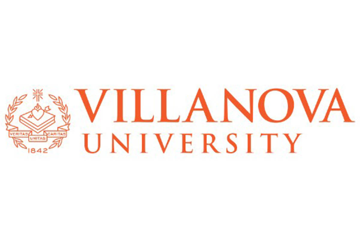
Do not use a color for the logo other than Villanova Blue, black, or white.
Do not rearrange the elements in the logo.
Do not place in a shape that could be thought of as part of the logo.
Do not skew, stretch, or tilt.
Do not put images on top of the logo.
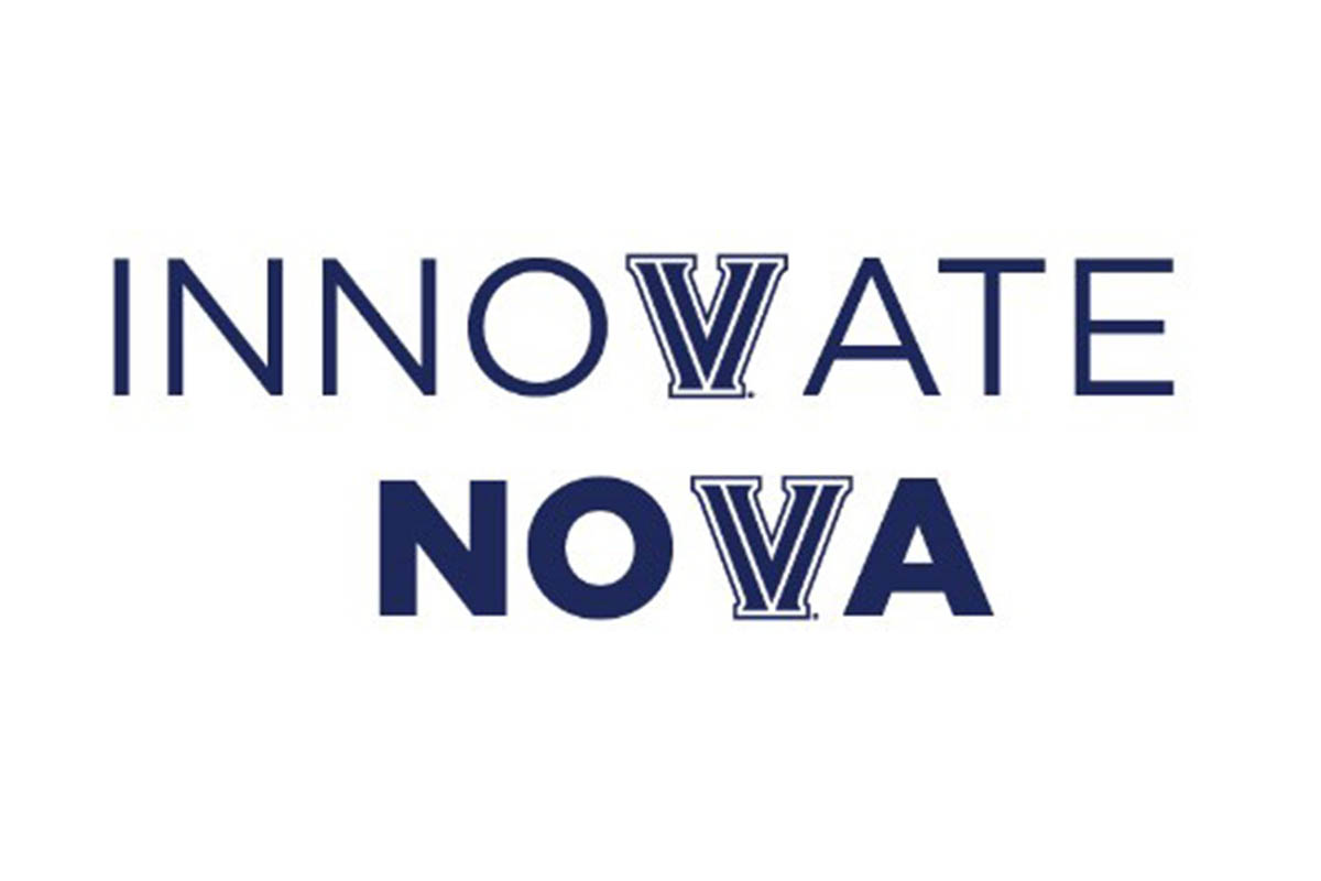
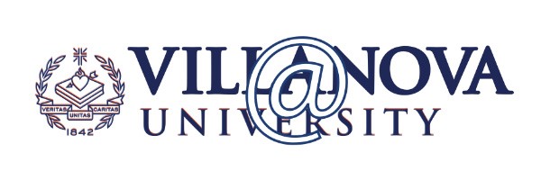
Do not place the V logo into other words.